COVID-19 Symptom Surveys through Facebook
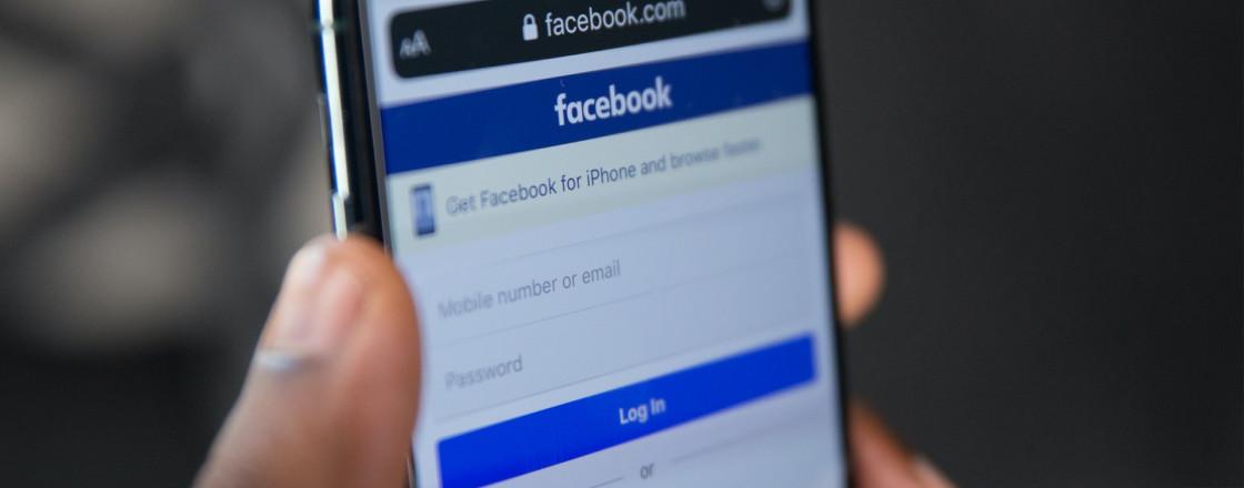
Since April 2020, in collaboration with Facebook, partner universities, and public health officials, we’ve been conducting a massive daily survey to monitor the spread and impact of the COVID-19 pandemic in the United States. Our survey is advertised through Facebook, but it’s run on our own Qualtrics platform (Facebook never sees any of the survey responses). This is an ongoing operation and our survey is taken by about 74,000 people each day. Respondents provide information about COVID-related symptoms, contacts, risk factors, and demographics, allowing us to examine county-level trends across the US. We believe that this combination of detail and scale has never before been available in a public health emergency.
We make aggregated data publicly available daily through our COVIDcast API, and visualize it on our COVIDcast interactive map. We also make (fully de-identified) individual survey responses available to researchers who agree to data use terms.
In this post, we’ll explore some initial findings from our analysis of two indicators of COVID-like illness derived from our survey data. We believe that this is just the tip of the iceberg in demonstrating what these surveys have to offer, and we’ll close the post by highlighting some of the exciting new directions that we’re pursuing now.
Short Background
Back in March 2020, we began discussions with Facebook about running a survey, advertised through their site, to collect real-time, county-level information on people experiencing COVID-like symptoms. The basic premise was that we could use this information to construct an early indicator of COVID activity in the US. To be sure, we weren’t the first group to think of running COVID-19 symptom surveys. Several others had already been deployed, including CovidNear You and COVID Symptom Study. What differentiated our project was a commitment to deploy a survey that could: (a) grow to be truly massive in size; and (b) be sustained at this size. We quickly realized that these goals could only be achieved with buy-in from a platform like Facebook. Fortunately for us, they agreed!
We launched our survey on April 6, 2020. Every day since, Facebook directs a random sample of its users to our survey, hosted on Qualtrics. As part of our agreement with Facebook, we receive the data directly from Qualtrics, and Facebook never sees any of the survey responses. We use the data only for research purposes, and only aggregated data is ever released publicly, with fully de-identified individual survey responses available only to researchers who agree to our data use terms.
As of this writing, our survey is taken by an average of 74,000 people per day, delivering enough data for us to create meaningful estimates for an average of nearly 1,000 counties per week. Over the course of the survey so far, we have already collected over 10 million responses! An international version of the survey, available in over 50 languages, was launched soon after by a team at the University of Maryland.
Before going into detail later about our survey and our survey-based indicators, here are a couple maps to ground your intuition. On the left is a state-level heatmap of the estimated percentage of people with COVID symptoms, based on our survey, averaged over June 15 to July 15. On the right is a heatmap of the number of daily new confirmed COVID-19 cases per 100,000 people, based on data from JHU CSSE, averaged over the same period. We can see some clear similarities in the intensity patterns, which already provides a nice sanity check.
library(covidcast)
library(dplyr)
library(gridExtra)

options(covidcast.auth = Sys.getenv("API_KEY")) # for more on API keys, see: https://cmu-delphi.github.io/delphi-epidata/api/api_keys.html

# Fetch Facebook % CLI signal and JHU confirmed case incidence proportion at
# the state level
start_day = "2020-06-15"
end_day = "2020-07-15"
df_fb = covidcast_signal("fb-survey", "smoothed_cli",
                         start_day, end_day, geo_type = "state")
df_in = covidcast_signal("jhu-csse", "confirmed_7dav_incidence_prop",
                         start_day, end_day, geo_type = "state")

# For each state, average the signals over all available times
df_fb_avg = df_fb %>% group_by(geo_value) %>% summarize(value = mean(value))
df_in_avg = df_in %>% group_by(geo_value) %>% summarize(value = mean(value))

# Turn these into covidcast_signal data frames that can be mapped
df_fb_avg = df_fb_avg %>%
  mutate(time_value = start_day) %>%
  as.covidcast_signal(signal = "fb_avg", geo_type = "state")

df_in_avg = df_in_avg %>%
  mutate(time_value = start_day) %>%
  as.covidcast_signal(signal = "in_avg", geo_type = "state")

# Plot choropleth maps, using the covidcast plotting functionality
subtitle = paste("Averaged over", start_day, "to", end_day)
p1 = plot(df_fb_avg,
          title = "% of people with COVID symptoms, based on Facebook surveys",
          range = c(0, 1), choro_params = list(subtitle = subtitle))
p2 = plot(df_in_avg,
          title = "Daily new confirmed COVID-19 cases per 100,000 people",
          range = c(0, 30), choro_params = list(subtitle = subtitle))
grid.arrange(p1, p2, nrow = 1)
We generated these plots using our covidcast R package. In all, fetching the data from our API and producing the heatmaps requires only 15 lines of code. If you’re interested, click the “Code” button to reveal the source. We’ll cover our R and Python covidcast packages in a future blog post.
Why Run These Surveys?
Now let’s unpack the main motivation behind our survey a bit: a person typically experiences COVID-like symptoms before they seek medical care or a COVID-19 test, so data on how many people are self-reporting COVID-like symptoms in a given county could potentially give us an early indicator of COVID activity in that county. And to be clear, it’s not just that we’re looking at symptoms that’s important here, it’s the way we’re measuring them: since symptoms can be reported from home, with no special equipment needed, this data isn’t subject to the same reporting delays as formal testing metrics like confirmed COVID-19 case counts. (Note that confirmed COVID-19 case counts aren’t just delayed, they are confounded by issues like testing policy and capacity, while self-reported symptom data shouldn’t be subject to the same problems. This is potentially a very important point, but much more subtle, and we won’t delve into it in this post.)
It’s also worth being clear about what we’re not able to say with these surveys:
Symptoms alone are not sufficient to diagnose coronavirus infections: of course, COVID-like symptoms can be caused by other conditions, and many true infections are asymptomatic. Therefore, even if we ignore the issues brought on by self-reporting and survey sampling, we can’t expect the estimates we produce to reflect the true rate of COVID-19 (and they’re not intended to).
Our survey responses come from the population of Facebook users in the US, which may be a sizeable fraction of the US population, but certainly not all of it. We’ll also likely see bias because some people on Facebook are more inclined to take surveys than others. We attempt to correct for both of these biases using a statistical reweighting scheme, but these corrections aren’t perfect.
Our symptom data is entirely self-reported, in contrast to data reported by medical professionals. Some fraction of the responses could be erroneous, either because a person misunderstood the question or chose to answer incorrectly.
To summarize, our survey can’t be used to make absolute statements about the true prevalence of coronavirus disease in the US; in fact, it shouldn’t even be regarded as a foolproof way of deriving unbiased estimates of the number of people with COVID-19 symptoms in the US (mainly due to the self-reporting aspect). Nevertheless, as we’ll see below, changes in self-reported symptoms over time can still be a meaningful reflection of the changes in coronavirus infections over time. And in the best case, it can help predict changes to come some days into the future.
What’s in the Survey?
Our survey has 4 sections and is about 35 questions long. The first section is short and gathers information on a core set of symptoms used to define a condition called COVID-like illness or CLI, which we define as fever of at least 100 °F, along with cough, shortness of breath, or difficulty breathing. This mirrors the standard definition of influenza-like illness or ILI (defined as fever of at least 100 °F, along with sore throat or cough), and is in line with the working definition of CLI used by the US Centers for Disease Control and Prevention (CDC).
Using data from responses to the survey’s first section, we can estimate two key quantities, in a given location, on a given day:
% CLI: the percentage of people with COVID-like illness; and
% CLI-in-community: the percentage of people who know someone in their local community with COVID-like illness.
Details on how we compute the % CLI and % CLI-in-community estimates can be found in our COVIDcast signals documentation.
The % CLI-in-community indicator has an interesting backstory: it was sort of a “happy accident” from an experiment we tried with surveys we were running in partnership with Google. (We’ll cover our Google survey in a future blog post.) The preliminary results from this experiment were exciting enough that we decided to add a similar question to our Facebook survey about a week after its initial launch.
The second section of the survey goes into more detail on symptoms, testing, and medical-seeking behavior. The third section gathers info on contacts and risk factors, and the fourth section gathers info on demographics. These survey questions provide a wealth of information that we haven’t fully tapped into (but plan to soon—see the end of this blog post). To give credit where it’s due: it was Facebook who initially suggested we run a longer survey with extensive questions on contacts, risk factors, and demographics. At first, we wanted to run a short survey with only the questions on COVID-like illness, and Facebook gathered ideas for more questions from several different research groups in public health. They assured us that lengthening the survey wouldn’t hurt the completion rate too much, and they were right: of the people who complete the first section, over 85% go on to finish the full survey!
Our survey documentation site includes more details about the survey, including the full text of every survey version. And yes, researchers can request access to (fully de-identified) individual survey responses for research purposes, provided they agree to keep data from individual respondents confidential.
Some Interesting Examples
Now we’ll turn to some interesting data examples that provide evidence that our survey-based CLI signals can be early indicators of COVID activity. We’ll consider the % CLI-in-community indicator, which tends to be more stable than the % CLI indicator (which shows similar, but noisier, trends). Let’s start by looking at Miami-Dade County, which experienced a surge of new COVID-19 cases between June and July: below we plot daily new confirmed COVID-19 cases over time (using a 7-day trailing average for smoothing) as a blue curve. We also plot the % CLI-in-community indicator as a red curve. Note that these two curves, case counts and % CLI-in-community, are not measured in the same units, hence our use of two y-axes: one on the left for case counts, and one on the right for % CLI-in-community.
library(ggplot2)
# Fetch Facebook % CLI-in-community signal and JHU confirmed case incidence
# numbers at the county level
start_day = "2020-06-01"
end_day = "2020-07-15"
df_fb = covidcast_signal("fb-survey", "smoothed_hh_cmnty_cli",
                         start_day, end_day, geo_type = "county")
df_in = covidcast_signal("jhu-csse", "confirmed_7dav_incidence_num",
                         start_day, end_day, geo_type = "county")

# Function to transform from one range to another
trans = function(x, from_range, to_range) {
  (x - from_range[1]) / (from_range[2] - from_range[1]) *
    (to_range[2] - to_range[1]) + to_range[1]
}

# Red, blue (similar to ggplot defaults), then yellow
ggplot_colors = c("#FC4E07", "#00AFBB", "#E7B800")

# Function to produce a plot comparing the signals for one county
plot_one = function(geo_value, title = NULL, xlab = NULL,
                    ylab1 = NULL, ylab2 = NULL, legend =  TRUE) {
  # Filter down the signal data frames
  given_geo_value = geo_value
  df_fb_one = df_fb %>% filter(geo_value == given_geo_value)
  df_in_one = df_in %>% filter(geo_value == given_geo_value)

  # Compute ranges of the two signals
  range1 = df_in_one %>% select("value") %>% range
  range2 = df_fb_one %>% select("value") %>% range

  # Convenience functions for our two signal ranges
  trans12 = function(x) trans(x, range1, range2)
  trans21 = function(x) trans(x, range2, range1)

  # Find state name, find abbreviation, then set title
  state_name = state_fips_to_name(paste0(substr(geo_value, 1, 2), "000"))
  state_abbr = name_to_abbr(state_name)
  title = paste0(county_fips_to_name(geo_value), ", ", state_abbr)

  # Transform the combined signal to the incidence range, then stack
  # these rowwise into one data frame
  df = select(rbind(df_fb_one %>% mutate_at("value", trans21),
                    df_in_one), c("time_value", "value"))
  df$signal = c(rep("% CLI-in-community", nrow(df_fb_one)),
                rep("New COVID-19 cases", nrow(df_in_one)))

  # Finally, plot both signals
  pos = ifelse(legend, "bottom", "none")
  return(ggplot(df, aes(x = time_value, y = value)) +
           geom_line(aes(color = signal)) +
           scale_color_manual(values = ggplot_colors[1:2]) +
           scale_y_continuous(name = ylab1, limits = range1,
                              sec.axis = sec_axis(trans = trans12,
                                                  name = ylab2)) +
           labs(title = title, x = xlab) + theme_bw() +
           theme(legend.pos = pos, legend.title = element_blank()))
}

# Produce a plot for Miami-Dade, and add vertical lines
plot_one(name_to_fips("Miami-Dade"), xlab = "Date",
         ylab1 = "Daily new confirmed COVID-19 cases",
         ylab2 = "% of people who know someone with CLI") +
  geom_vline(xintercept = as.numeric(as.Date("2020-06-19")),
             linetype = 2, size = 1, color = ggplot_colors[1]) +
  geom_vline(xintercept = as.numeric(as.Date("2020-06-25")),
             linetype = 2, size = 1, color = ggplot_colors[2])
This example, as with all code examples in this blog post, was produced using our covidcast R package.
A first glance reveals that the % CLI-in-community indicator clearly rises alongside confirmed COVID-19 cases, a reassuring sanity check: more people indeed report that others are sick in their community at times when COVID-19 tests confirm more cases. But a closer look shows something quite interesting: the % CLI-in-community signal begins to rise steeply on June 19 (first dashed vertical line), which happens 6 days before COVID-19 cases begin their steep ascent on June 25 (second dashed vertical line).
This is just one county; to investigate further, we pulled the 20 counties with the biggest increase in new COVID-19 cases between June 1 and July 15, and made the plots below, with COVID-19 cases in blue and the % CLI-in-community indicator in red. We can see that the % CLI-in-community indicator is (a) never lagging and (b) leading in many counties; for example, Dallas County, Orange County, Hidalgo County, and Nueces County are a few notable examples.
num = 20
geo_values = df_in %>% group_by(geo_value) %>%
  summarize(diff = last(value) - first(value)) %>%
  arrange(desc(diff)) %>% head(num) %>% pull(geo_value)

p_list = vector("list", num)
for (i in 1:num) {
  p_list[[i]] = plot_one(geo_values[i], legend = FALSE)
}
do.call(grid.arrange, c(p_list, nrow = 5, ncol = 4))
The examples above are an informal way of looking at the recall of the % CLI-in-community signal. Of course, this is only one half of the story: for the signal to be a useful early indicator, we’d also need to know something about its precision: we’d need to know that % CLI-in-community seldom rises in periods where new COVID-19 cases remain flat. We save a formal precision-recall analysis for future work.
Basic Correlation Analysis
To complement the more exploratory, qualitative analysis of the last section, we’ll conduct a simple quantitative analysis here, by computing some basic measures of correlation between our survey-based indicators and confirmed COVID-19 case rates. There are a couple of ways to slice the data—by day and by county—and we’ll consider both ways in what follows.
Correlations Sliced by Time
First we compute, for each day between April 15 and August 15, the Spearman correlation between the % CLI indicator and COVID-19 case rates, across the counties that had at least 500 cumulative confirmed COVID-19 cases. (Spearman correlation assesses whether one variable is high when another is high, even if their relationship is not linear.) We do the same for the % CLI-in-community indicator, and plot the results below, with the % CLI indicator correlations in red, and the % CLI-in-community correlations in blue. We can see clearly that the % CLI-in-community indicator produces, consistently across all time, much higher correlations. Even in an absolute sense, the correlations from the % CLI-in-community are noteworthy: they reach over 0.8 for a period between July and August.
# Fetch Facebook % CLI signal, % CLI-in-community signal and JHU confirmed case
# incidence proportions, all at the county level, over a long time period
start_day = "2020-04-15"
end_day = "2020-08-15"
df_fb1 = covidcast_signal("fb-survey", "smoothed_cli",
                          start_day, end_day, geo_type = "county")
df_fb2 = covidcast_signal("fb-survey", "smoothed_hh_cmnty_cli",
                          start_day, end_day, geo_type = "county")
df_in = covidcast_signal("jhu-csse", "confirmed_7dav_incidence_prop",
                         start_day, end_day, geo_type = "county")

# Consider only counties with at least 500 cumulative cases so far
case_num = 500
geo_values = covidcast_signal("jhu-csse", "confirmed_cumulative_num",
                              max(df_in$time_value), max(df_in$time_value),
                              geo_type = "county") %>%
  filter(value >= case_num) %>% pull(geo_value)
df_fb1_act = df_fb1 %>% filter(geo_value %in% geo_values)
df_fb2_act = df_fb2 %>% filter(geo_value %in% geo_values)
df_in_act = df_in %>% filter(geo_value %in% geo_values)

# Compute correlations, per time, over all counties
df_cor1 = covidcast_cor(df_fb1_act, df_in_act, by = "time_value",
                        method = "spearman")
df_cor2 = covidcast_cor(df_fb2_act, df_in_act, by = "time_value",
                        method = "spearman")

# Stack rowwise into one data frame, then plot time series
df_cor = rbind(df_cor1, df_cor2)
df_cor$signal = c(rep("% CLI", nrow(df_cor1)),
                  rep("% CLI-in-community", nrow(df_cor2)))
ggplot(df_cor, aes(x = time_value, y = value)) +
  geom_line(aes(color = signal)) +
  scale_color_manual(values = ggplot_colors[c(3, 1)]) +
  labs(title = "Correlation between CLI signals and case rates",
       subtitle = sprintf("Over all counties with at least %i cumulative cases",
                          case_num), x = "Date", y = "Correlation") +
    theme_bw() + theme(legend.pos = "bottom", legend.title = element_blank())
Another interesting observation is that the correlations from either indicator increase dramatically sometime around mid-June. This could be because many counties saw big surges in COVID-19 activity around that time. These surges created a larger spread between the COVID-19 case rates across the country, and so county-to-county differences started to become easier to track with the indicators, as the magnitude of these differences started to swamp the noise.
Of course, this is really just speculation, and we can’t say for certain that this is the cause. Some decent empirical evidence for our explanation, however, can be found by looking at how COVID-19 case rates vary between counties over time, as shown below. The median absolute deviation (a robust measure of spread) between counties rises sharply sometime around mid-June, around the same time as the correlations increased.
ggplot(df_in_act %>% group_by(time_value) %>%
         summarize(mad = mad(value, na.rm = TRUE)),
       aes(x = time_value, y = mad)) + geom_line() +
  labs(title = "Median absolute deviation in COVID-19 case rates",
       subtitle = sprintf("Over all counties with at least %i cumulative cases",
                          case_num), x = "Date", y = "Median abs deviation") +
  theme_bw()
Correlations Sliced by County
Next we compute, for each county with at least 500 cumulative cases, the Spearman correlations between each of our indicators and COVID-19 case rates, across all time. We can visualize this in a few different ways. Below we plot estimated densities from these two sets of correlations: from the % CLI indicator in red, and the % CLI-in-community indicator in blue. With this slice of the data (correlations by county, rather than by day), we again see that the % CLI-in-community indicator produces much higher correlations.
# Compute correlations, per county, over all time
df_cor1 = covidcast_cor(df_fb1_act, df_in_act, by = "geo_value")
df_cor2 = covidcast_cor(df_fb2_act, df_in_act, by = "geo_value")

# Stack rowwise into one data frame, then plot densities
df_cor = rbind(df_cor1, df_cor2)
df_cor$signal = c(rep("% CLI", nrow(df_cor1)),
                  rep("% CLI-in-community", nrow(df_cor2)))
ggplot(df_cor, aes(value)) +
  geom_density(aes(color = signal, fill = signal), alpha = 0.5) +
  scale_color_manual(values = ggplot_colors[c(3,1)]) +
  scale_fill_manual(values = ggplot_colors[c(3,1)]) +
  labs(title = "Correlation between CLI signals and case rates",
       subtitle = sprintf("Over all counties with at least %i cumulative cases",
                          case_num), x = "Correlation", y = "Density") +
  theme_bw() + theme(legend.pos = "bottom", legend.title = element_blank())
We can also examine choropleth maps of these correlations to learn where (geographically speaking) they’re high and where they’re not. As we can see from the maps below, the % CLI-in-community indicator yields high correlations throughout much of the US, whereas the % CLI indicator is a bit more spotty. Note that here a gray color denotes a missing value: either that county had below 500 cumulative COVID-19 cases, or we didn’t have enough data from the surveys in order to estimate % CLI and % CLI-in-community signals there.
# Use as.covidcast_signal to turn these into mappable signals
df_cor1 = df_cor1 %>%
  mutate(time_value = start_day) %>%
  as.covidcast_signal(signal = "cor1")
df_cor2 = df_cor2 %>%
  mutate(time_value = start_day) %>%
  as.covidcast_signal(signal = "cor1")

# Plot choropleth maps, using the covidcast plotting functionality
p1 = plot(df_cor1, title = "Correlation between % CLI and case rates",
          range = c(-1, 1), choro_col = cm.colors(10))
p2 = plot(df_cor2, title = "Correlation between % CLI-in-community and case rates",
          range = c(-1, 1), choro_col = cm.colors(10))
grid.arrange(p1, p2, nrow = 1)
What’s Next with the Surveys
You might expect that a survey that reaches tens of thousands of respondents within the US daily—and has done so for months during a major pandemic—could have many possible uses beyond simply surveying symptoms. You would be right. Beyond the first section on the core COVID symptoms, our survey contains questions on testing, behavior, medical care, mental health, and related topics, opening a multitude of possible research questions up to empirical inquiry.
This is why Delphi and the University of Maryland (for the international version) offer direct access to the survey data to academic and non-profit researchers, who agree to data use terms (requiring, for one, that researchers don’t attempt to identify respondents and don’t release individual survey responses, only averages and other aggregates). So far, over a dozen research groups sought and received access to our survey data, and are using it to study various aspects of the pandemic. We’re actively seeking researchers studying important public health problems to apply for access through a form managed by Facebook, and our goal is to build a network of researchers committed to fighting the pandemic through our survey data.
To take these efforts to the next level, we’ll soon release a new version of the survey. Based on feedback from other researchers, public health agencies, the University of Maryland, and Facebook, we’ve added items asking about:
- More details on COVID testing (including whether the respondent tried to get tested but could not).
- Mask wearing.
- The types of activities the respondent has done with other people.
- Mental health and social isolation.
- Employment.
- Demographics (including race and education).
These items will give us an unprecedented view into how people have responded to the pandemic, how they have been affected by the pandemic and the resulting economic downturn, and how specific groups are affected. We hope the mask and behavior items can help researchers studying how best to prevent the spread of COVID-19, and can even help inform forecasts, while mental health and isolation items will help researchers to understand how social distancing and recession have affected mental health. Together with extended demographic data, this may help to inform policies designed to help those most affected by the pandemic.
This new survey is currently being deployed, and data should become available in the next few weeks. Detailed data will be available to researchers, while new aggregates—such as of mask-wearing—will be made public, as usual, through our COVIDcast API and COVIDcast interactive map.
Acknowledgements: Logan Brooks and Katie Mazaitis wrote the initial code for processing the survey data and producing estimates. Taylor Arnold, Amartya Basu, and Alex Reinhart provided huge help with refactoring and improving this codebase. Logan Brooks, Pratik Patil, Rob Tibshirani, and Ryan Tibshirani developed the statistical methodology behind the estimates computed from the survey data. The COVIDcast API, which serves these estimates and is updated daily, is a much larger effort run by the Delphi group, and our entire engineering team is owed a lot of credit here. Ryan came up with the idea of running the surveys, and worked with Facebook to make this a reality. On the Facebook side, Curtiss Cobb and Jonathan McKay played big roles. The University of Maryland team, including Adrianne Bradford and Samantha Chiu and led by Frauke Kreuter, made many contributions to the survey design.


